Matplotlib多纵轴(寄生轴)散点图
发布于:2019-05-22 | 分类:python/vba/cpp
我们知道Matplotlib散点图的一个纵轴上可以画多条曲线,当纵轴数据属于不同类型(例如温度和压力)或者不同尺度,那就需要更多的纵轴来分别容纳。这类似于Excel图表中的次坐标轴,只不过Matplotlib可以呈现更多的纵轴。本文基于Matplotlib官网给出的实例封装了一个实现寄生轴散点图的函数。
概述
这些纵轴y axes共享同一横轴x axes数据,因此有两种思路可以实现:
- 孪生轴
matplotlib.axes.Axes.twinx,基于同一个x轴但各自独立的一系列轴 - 寄生轴,包括一个主轴
parasite_axes.HostAxes和从主轴构造的多个寄生轴parasite_axes.ParasiteAxes
Matplotlib官网给出了三个实例,分别采用了普通孪生轴,基于parasite_axes下host_subplot的孪生轴,以及parasite_axes下寄生轴的方法:
代码
本文基于parasite_axes寄生轴的方式封装了如下函数:
'''
Create a parasite axes, which would share the x scale with a host axes,
but show a different scale in y direction.
This approach uses the parasite_axes' HostAxes and ParasiteAxes referenced from:
https://matplotlib.org/3.1.1/gallery/axisartist/demo_parasite_axes.html
params:
xdata: 1d numpy array
ydata: a list of structured array, each array represents one or more curves in associated y-axis.
the field name of structured array become curve label. A reference to structed array:
https://docs.scipy.org/doc/numpy/user/basics.rec.html
xlabel: x label, `X` by default
ylabels: list of label for each parasite axes, Y-0, Y-1 by default
title: figure title
colors: a list of colors for each curve, jet colormap by default
markers: a list of markers for each curve, none by default
linestyles: a list of line styles for each curve, solid line ('-') by default
savefile: save figure if true else plot only
colors, markers, linestyles are ignored if the length less than the count of all curves.
'''
import matplotlib.pyplot as plt
from mpl_toolkits.axisartist.parasite_axes import HostAxes, ParasiteAxes
from matplotlib import cm
import numpy as np
def parasite_axes(xdata, ydata, xlabel=None, ylabels=None, title=None, colors=None, markers=None, linestyles=None, savefile=None):
fig = plt.figure(figsize=(10,7))
# host axis
# - span for plotting multi-y axes
# - hide axes
span = 0.05*len(ydata) + 0.01
host = HostAxes(fig, [span, 0.1, 0.88-span, 0.8]) # left, bottom, width, height
host.axis['left','right'].set_visible(False)
host.axis['top'].toggle(all=False)
host.set_xlabel(xlabel if xlabel else 'X')
host.set_xlim(int(min(xdata)), int(max(xdata)))
# create parasite axes
para_axes = [ParasiteAxes(host, sharex=host) for _ in ydata]
# count of curves in all axes
num = sum(len(data.dtype.names) for data in ydata)
if not ylabels:
ylabels = ['Y-{0}'.format(i) for i in range(len(ydata))]
if not colors or len(colors)<num:
colors = [cm.jet(x) for x in np.linspace(0.0, 1.0, num)]
if not linestyles or len(linestyles)<num:
linestyles = ['-'] * num
if not markers or len(markers)<num:
markers = [''] * num
curve_index = 0
for i, (par, ylabel, data) in enumerate(zip(para_axes, ylabels, ydata)):
host.parasites.append(par)
par.axis['new_left'] = par._grid_helper.new_fixed_axis(
loc='left',
axes=par,
offset=(-35*i, 0))
# add curve
for curve_name in data.dtype.names:
par.plot(xdata, data[curve_name],
label=curve_name,
color=colors[curve_index],
linestyle=linestyles[curve_index],
marker=markers[curve_index],
linewidth=0.5)
curve_index += 1
# label
par.set_ylabel(ylabel)
par.axis['left'].label.set_pad(0)
# limits and ticks
# numpy_array = data.view((data.dtype[0], len(data.dtype.names)))
numpy_array = np.array(data.tolist())
y_min, y_max = np.min(numpy_array), np.max(numpy_array)
ylim_min = round(y_min-0.1*(y_max-y_min), 1)
ylim_max = round(y_max+0.2*(y_max-y_min), 1)
par.set_ylim(ylim_min, ylim_max)
par.set_yticks(np.linspace(ylim_min, ylim_max, 5))
par.axis['new_left'].major_ticklabels.set_axis_direction('top')
# grid on
para_axes[0].grid(True, linestyle='--')
para_axes[0].axis['right'].set_visible(True)
host.set_title(title if title else 'No Title')
host.legend(loc='upper left', bbox_to_anchor=(1.01, 1))
fig.add_axes(host)
if not savefile:
plt.show()
else:
plt.savefig(savefile, dpi=120)
if __name__ == '__main__':
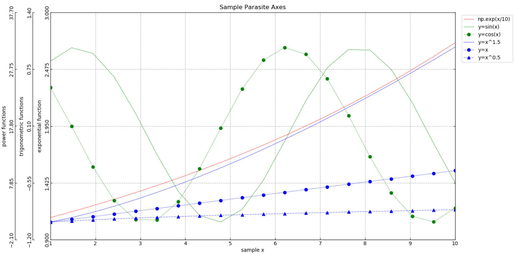
xdata = np.linspace(1, 10, 20)
ydata = [None] * 3
ylabels = []
colors, linestyles, markers = [], [], []
# y axis 1
ydata[0] = np.core.records.fromarrays([np.exp(xdata/10)], names='np.exp(x/10)')
ylabels.append('exponential function')
colors.append('r')
linestyles.append('-')
markers.append('')
# y axis 2
ydata[1] = np.core.records.fromarrays([np.sin(xdata), np.cos(xdata)], names='y=sin(x), y=cos(x)')
ylabels.append('trigonometric functions')
colors.extend(['g']*2)
linestyles.extend(['-', '--'])
markers.extend(['', 'o'])
# y axis 3
ydata[2] = np.core.records.fromarrays([xdata**1.5, xdata, xdata**0.5], names='y=x^1.5, y=x, y=x^0.5')
ylabels.append('power functions')
colors.extend(['b']*3)
linestyles.extend(['-', '--', '-.'])
markers.extend(['', 'o', '^'])
parasite_axes(xdata, ydata, title='Sample Parasite Axes', xlabel='sample x',
ylabels=ylabels, colors=colors, linestyles=linestyles, markers=markers)测试实例显示结果如下: